This is an excerpt of a piece Josh MacPhee wrote for the Justseeds Artists’ Cooperative blog “Behind Design.” In it he describes the thought and work that went into the current cover art for Perspectives on Anarchist Theory.
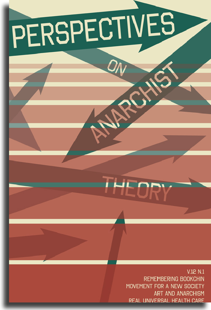
I wanna show what went into the creation of the cover design for the new issue of Perspectives on Anarchist Theory, which went on sale in the Justseeds store this week. Perspectives started out a simple 4-8 page newsletter for the Institute for Anarchist Studies (IAS) almost twenty years ago. Twelve years ago it merged with the publication The New Formulation: An Anti-Authoritarian Review of Books to become a traditional magazine-sized (8.5″ x 11″) publication, running 48-60 pages per issue. This format stuck for a couple years, then their were multiple single-issue attempts to convert it into a journal-sized format. I joined the board of directors of the IAS in 2009, and it was decided to relaunch it once again as a journal, but this time to have an editorial board that was connected to, but not the same as, the board of directors of the IAS. I took over design duties, and Perspectives v.12 n.1 was the first issue I did the cover for. It quickly sold out, and it was decided that this was the format we were going to stick with.
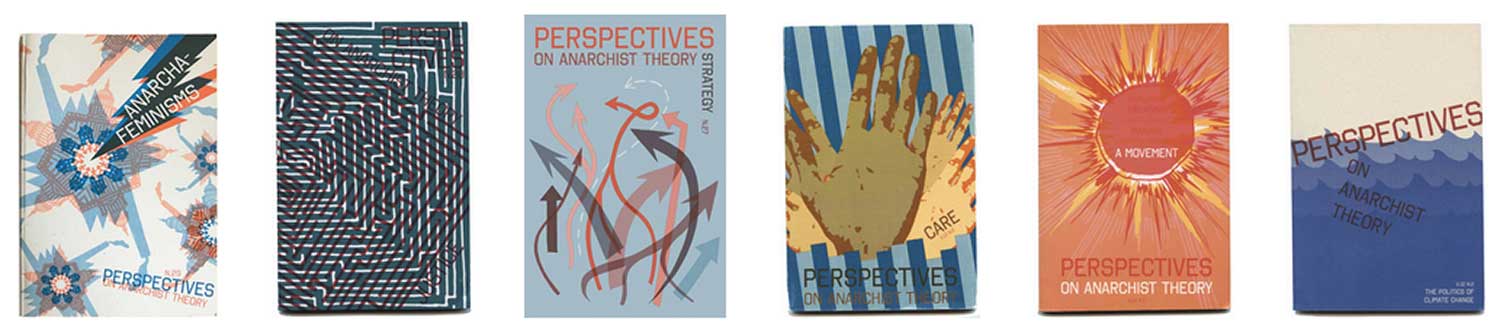
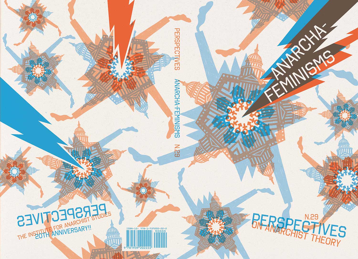
Anyway, that’s a long intro to get us up to the present, issue #29, the seventh cover I’ve designed for the publication. Every single cover has been a 2-color duotone design, and all but one have been printed by Charles at Eberhardt Press in Portland, OR. Last Fall I got a message from Paul, one of the editors, that the theme of this issue was going to be Anarcha-Feminisms, and that it was going to be a killer issue, with tons of great contributions. I wanted to give it a great cover, and really help push the theme since contemporary anarchism can all-to-often have a masculinized cast, from macho militant posturing to empty pseudo-intellectual blathering.
The trouble is, how do you visually represent anarcha-feminism? It’s more a theoretical tool than a set of actions, or historical milieu. The easy photo reference is the Mujeres Libres during the Spanish Revolution, but that seems too easy, too overdone, and not in any way a fair representation of how people are attempting to use anarcha-feminism as a concept today. The other dominant imagery is the woman’s symbol with a circle a in the middle of it. While the “feminism” aspect here is key, I feel like it is a balancing act between acknowledging that feminism is a movement to liberate women, and tethering it to be only about women. In my ideal world I would want all people to be anarcha-feminists, from women to men to everyone in-between and outside traditional gender identities. So how to recognize the core element of women’s liberation without over-determining it?
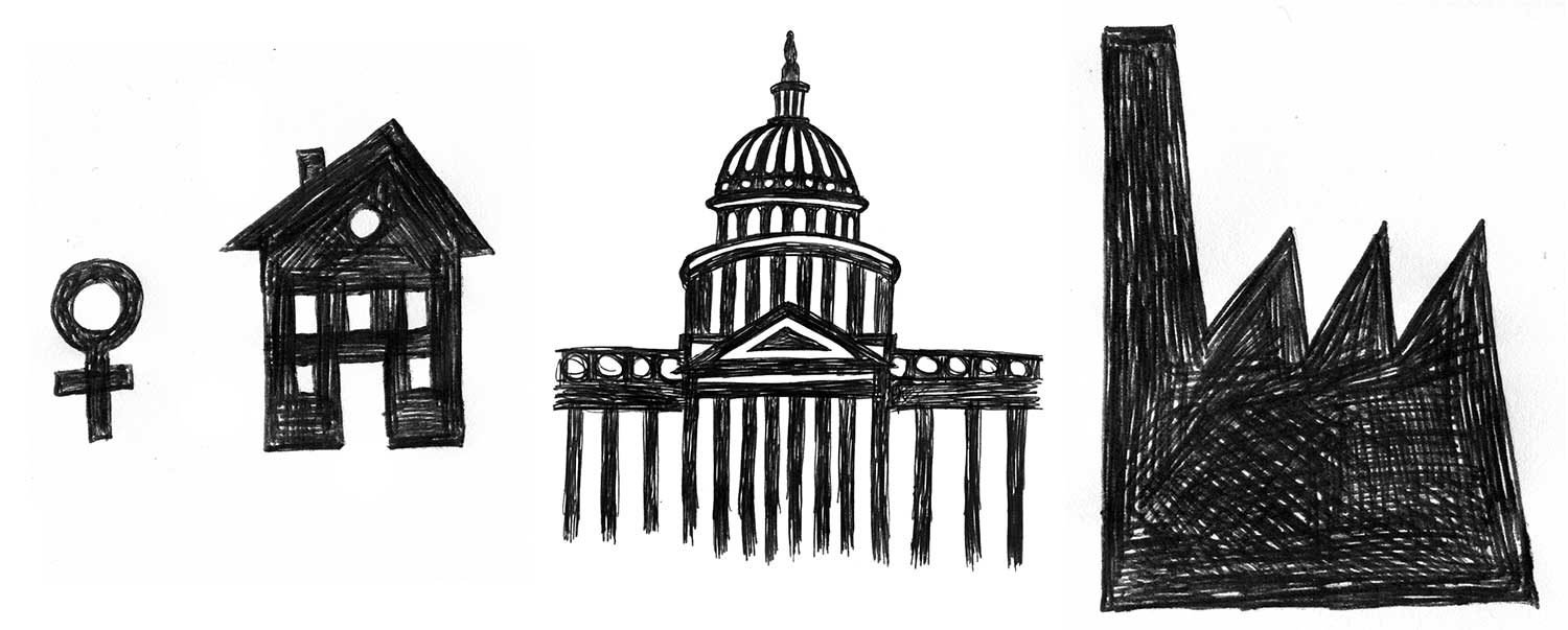
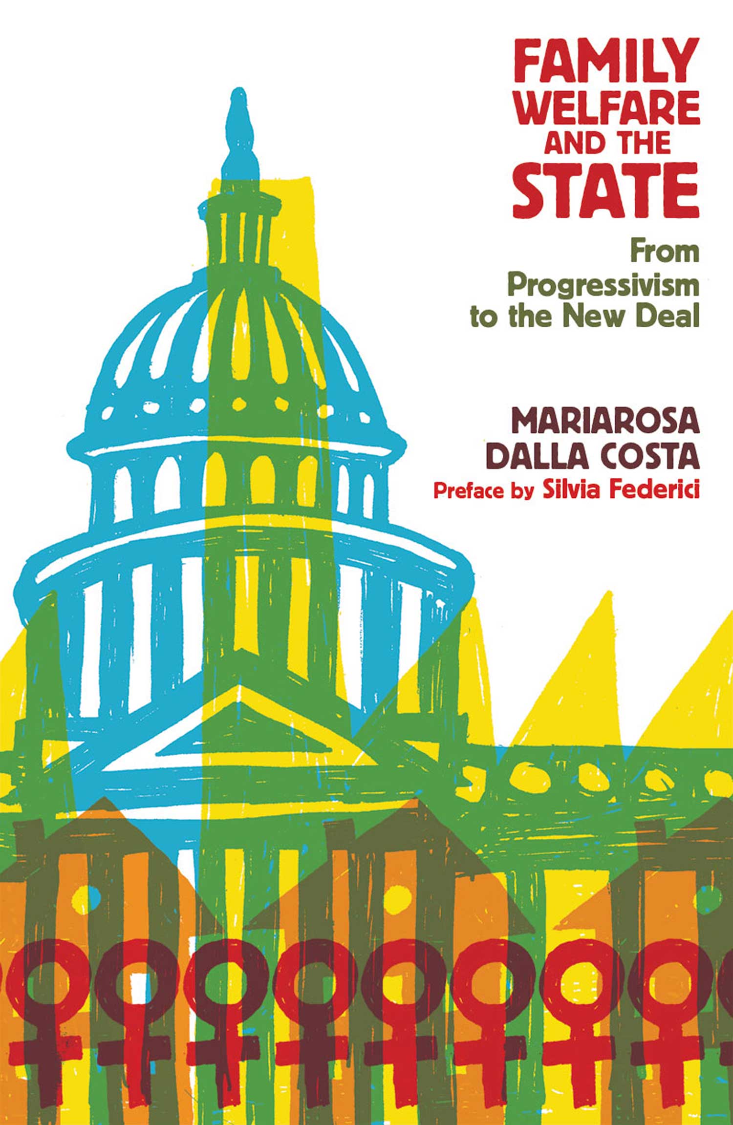
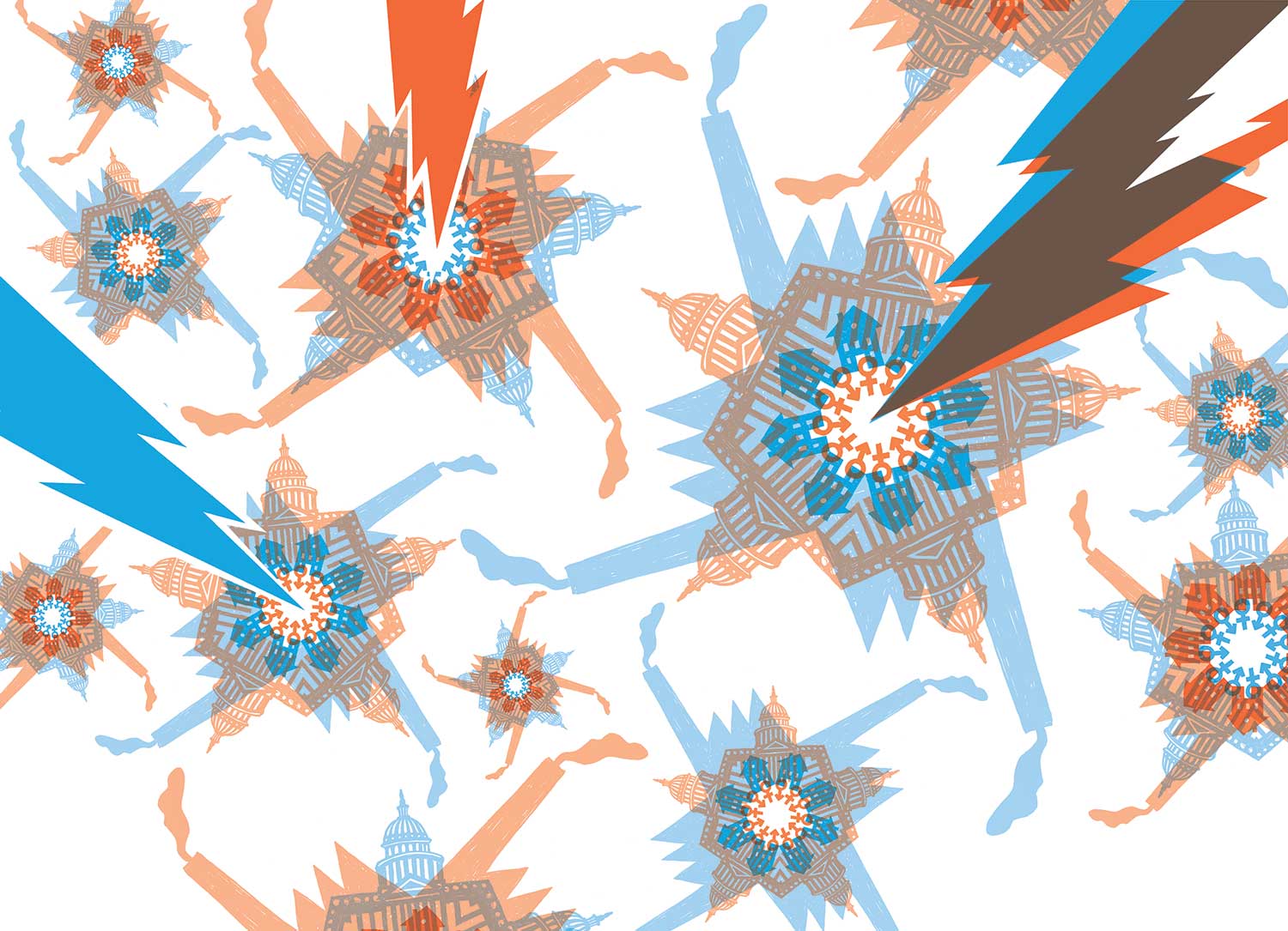
Earlier in 2015 I had designed a cover for the Italian feminist theorist Mariarosa Dalla Costa’s book on welfare in the US, Family, Welfare, and the State. In early deign ideas for that book I had come up with simple iconographic representations of the elements that make up social reproduction and repression for women, including the workplace (a factory), the state (a government building), the family (a home), and women themselves (the women’s symbols). I worked through tons of iterations of these icons, including a collection of “monsters” made up of these elements. For that cover, the icons ended up only being used lightly in the background, but I still felt that the monster elements were strong, and could find a future use.
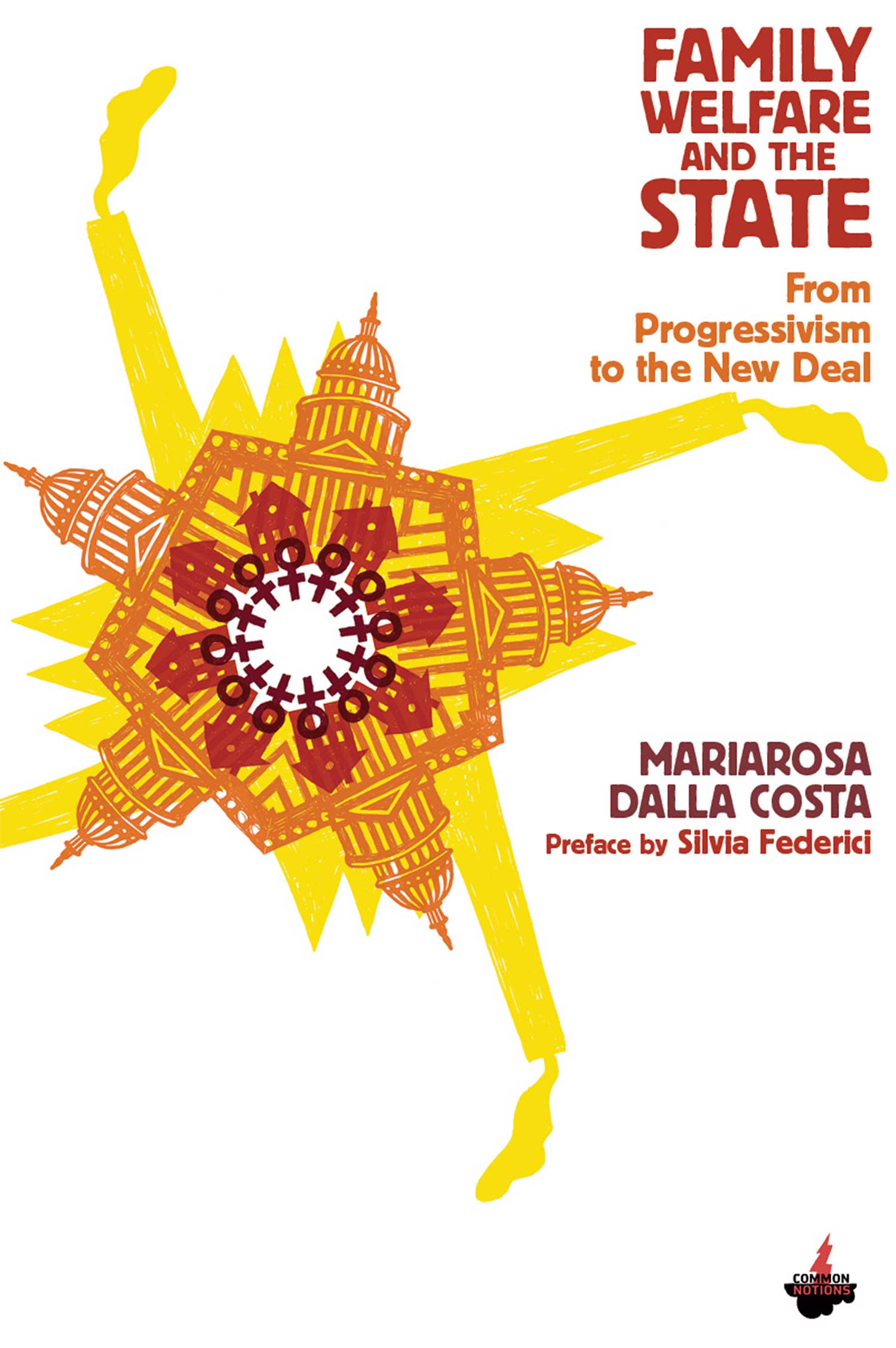
I hit on the idea of recycling the monsters, but turning them into gears, the components that work together to create the network of power we all live within, draw from, and struggle against. (This kind of reworking of earlier design elements is something I am always doing, but I have to admit it became extremely useful here, since I had a newborn at home demanding just about all my attention!) And I imagine “anarcha-feminism” as a wrench that can be thrown into those gears—that can critically analyze and pull apart power and social structures so that we can start to dismantle them. So I reworked the icons into two-color gears, and spread them out across the field of the cover, adding the titles and other text at sharp angles, as if they are being jammed into the works. One of the important aspects for me about this design is that women are not somehow magically outside the mechanisms of social repression. We are all our own enemies. This is part of what makes capitalism so strong, it bends us into beings that suppress our own interests and desires. The circle A women’s symbol is purely affirmative: anarchism + woman = power/liberation/freedom. We need to understand the world in more complicated terms than that.
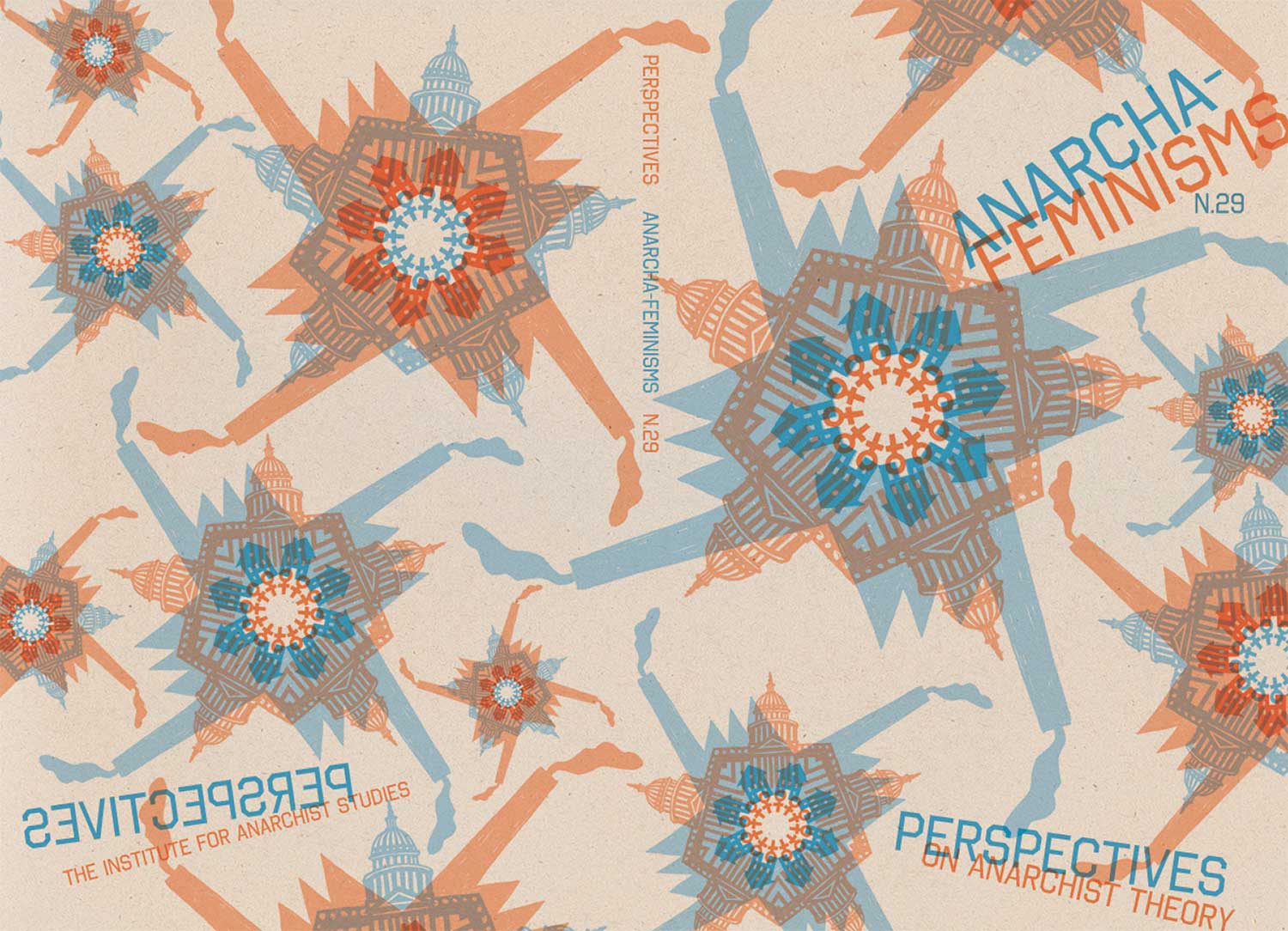
The editors were skeptical at first, but it grew on them. There were serious concerns that the gears looked like swastikas, but I tried to convince them that that wasn’t such a terrible thing, as it is our own social reproduction that enslaves us. I know that since I began working for myself I give myself almost no breaks, take no days off, and work way harder than I ever did at a regular day job.
This initial design was put up on Facebook for feedback, which led to a lot of comments I didn’t find very useful, but a couple that ended up getting worked into the final design. First, it was raised that the central icon of the women’s symbol would make much more sense to be both men’s and women’s symbols. Most definitely, so that was changed. There is the additional benefit of this change that now there is the inference that gender binaries are part of the problem. The second feedback element that I felt I had to take seriously was the lack of visual resistance in the design. While the words were at angles with the gears, they weren’t actually touching them, and certainly weren’t clearly causing the gears to stop or break. Although I find representing future resistance difficult (I don’t want to be prescriptive, and I feel like imagery of resistance too often draws on past moments that we are no longer in, and therefore short circuits the imagination of what future resistance can look like), I understand there is a strong desire for people to see it, and feel connected to it. Converting the text into lightening bolts seemed like a nice compromise, making for a more dynamic visual but also keeping the representation abstract.
Overall I’m really happy with how the design turned out, and definitely happy with how it was printed. The blue and the orange work well together and are unexpected, not the usual black and red, or black and purple, that get used for anarchist and feminist graphic works. I suspect most people might not take the time to really inspect the nuanced elements of the cover, but I hope those that do are rewarded by it! Pick up a copy for yourself today.